
PackMeme
Interaction Design
2021

Where digital wit meets physical wonder
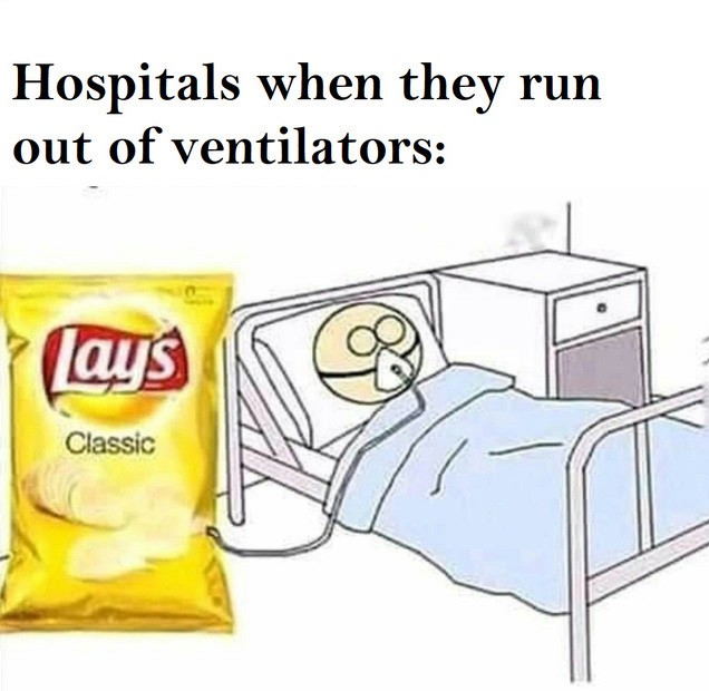
PackMeme is a series of interactive objects that transform familiar food packaging into surprising, meme-inspired experiences. By leveraging the universal recognition of everyday packaging like chip bags and cans, the project creates cognitive surprise through intentional mismatches between expectation and reality, offering tangible interactions that spark joy and wonder.
Research & Design Mission
The Problem
In our digital age, genuine surprise and spontaneous joy are increasingly rare in physical interactions. While memes excel at delivering unexpected delight online, there's a disconnect between our digital humor and physical experiences, leaving opportunities for playful interaction unexplored in our everyday environment.


Research Process
Understanding Surprise
Life thrives on moments of unexpected joy and serendipitous encounters. Our research began with a fundamental question: what really sparks that fleeting sensation of surprise? Driven by the playful unpredictability of memes, we explored various creative works to decipher the quintessential design elements that create genuine moments of delight.
Cognitive Surprise Framework
Through intensive study and analysis, we developed a framework for understanding how surprise functions in user interaction. When users first encounter an object, they process information through the elements presented and compare this against their life experiences. If the visual cues align with familiar patterns, they form expectations based on past experiences—seeing the object as "something familiar." This process of experiential perception establishes cognition, which is then tested through interaction. When users discover their initial understanding was incorrect through engagement, they experience cognitive surprise.
Meme Analysis
We examined the viral nature of memes and their unparalleled ability to spread rapidly while inducing spontaneous smiles. Memes succeed because they subvert expectations, combining familiar formats with unexpected content. This insight became central to our design strategy—using universally recognized packaging as a trojan horse for delightful, unexpected experiences.

The Approach
Our design concept centers on cognitive surprise by leveraging universally recognized food packaging. We deliberately chose packaging styles that are broadly familiar—potato chip bags, cans, and similar containers—because they carry strong associations and clear expectations. Users naturally assume such packaging contains food-related items, creating a perfect setup for experiential subversion.
The approach operates on three key principles:
Familiar Visual Language: Using recognizable packaging to establish clear expectations
Unexpected Content: Delivering playful, meme-inspired experiences that contradict initial assumptions
Interactive Revelation: Requiring user engagement to discover the surprise, making the revelation more impactful

Project Highlights
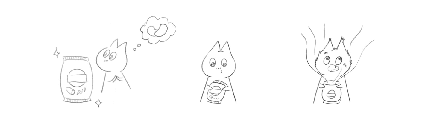
Tasty Breeze
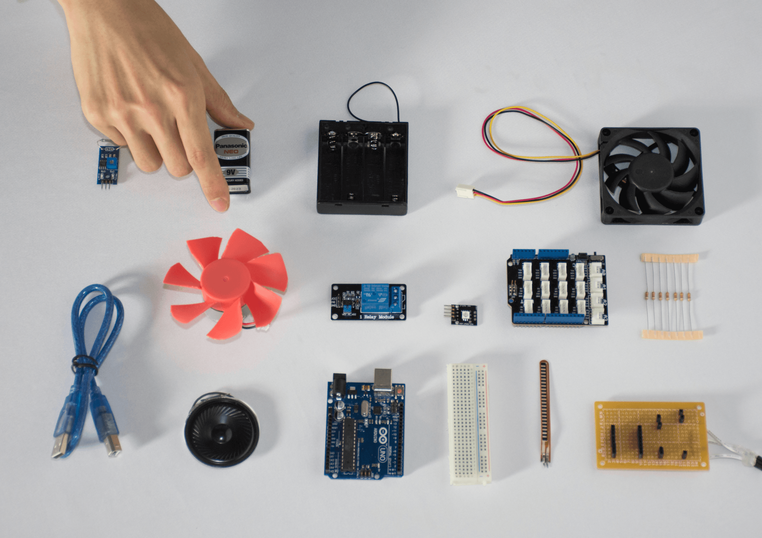
A familiar snack packaging that offers a playful commentary on how commercial chip bags contain more air than actual chips. When users open the package, a hidden magnetic reed switch triggers a small internal fan, creating a gentle breeze that's immediately felt by the user. This unexpected airflow transforms the frustration of "empty" packaging into a delightful surprise, literally turning the bag into a hand-held fan and reframing the excess air as a feature rather than a flaw.

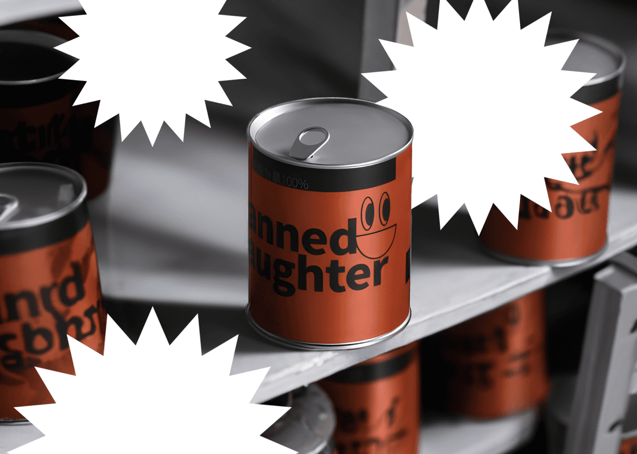
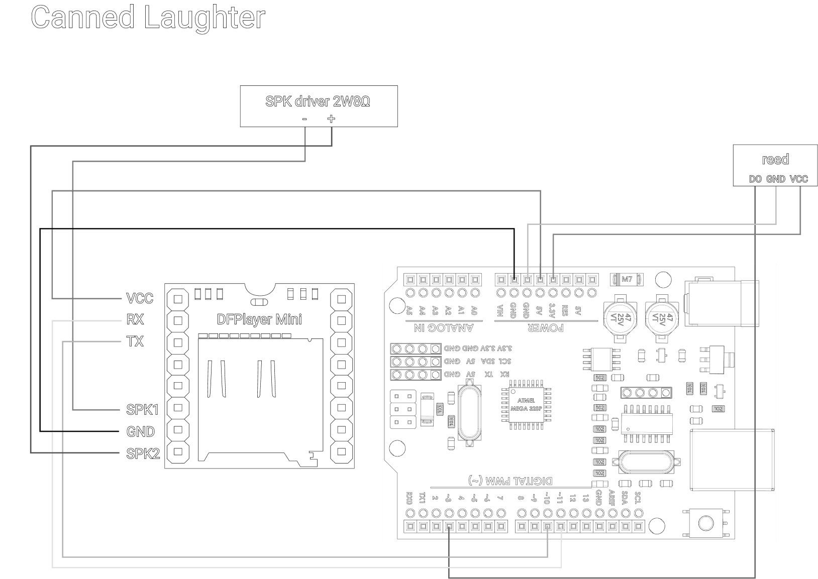
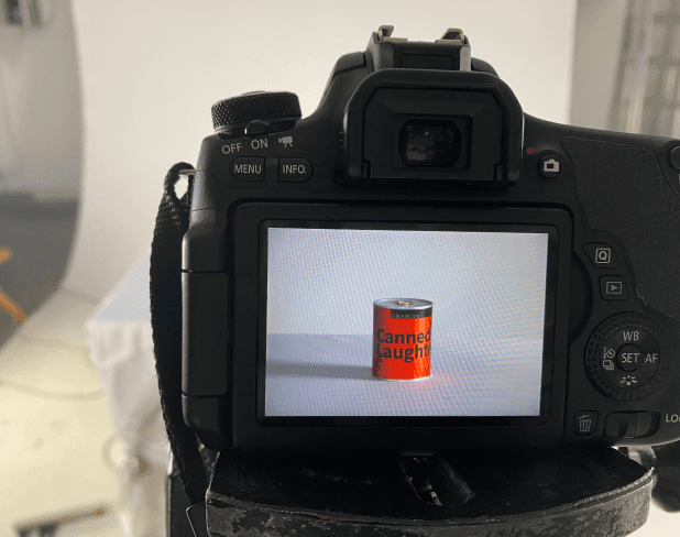
Canned Laughter
A realistic beverage can that addresses the universal awkwardness of failed jokes. When someone pulls the tab, a hidden magnetic reed switch triggers pre-recorded laughter through Arduino-controlled speakers. This instant audio response transforms uncomfortable silences into shared moments of humor, offering both genuine relief and satirical commentary on social

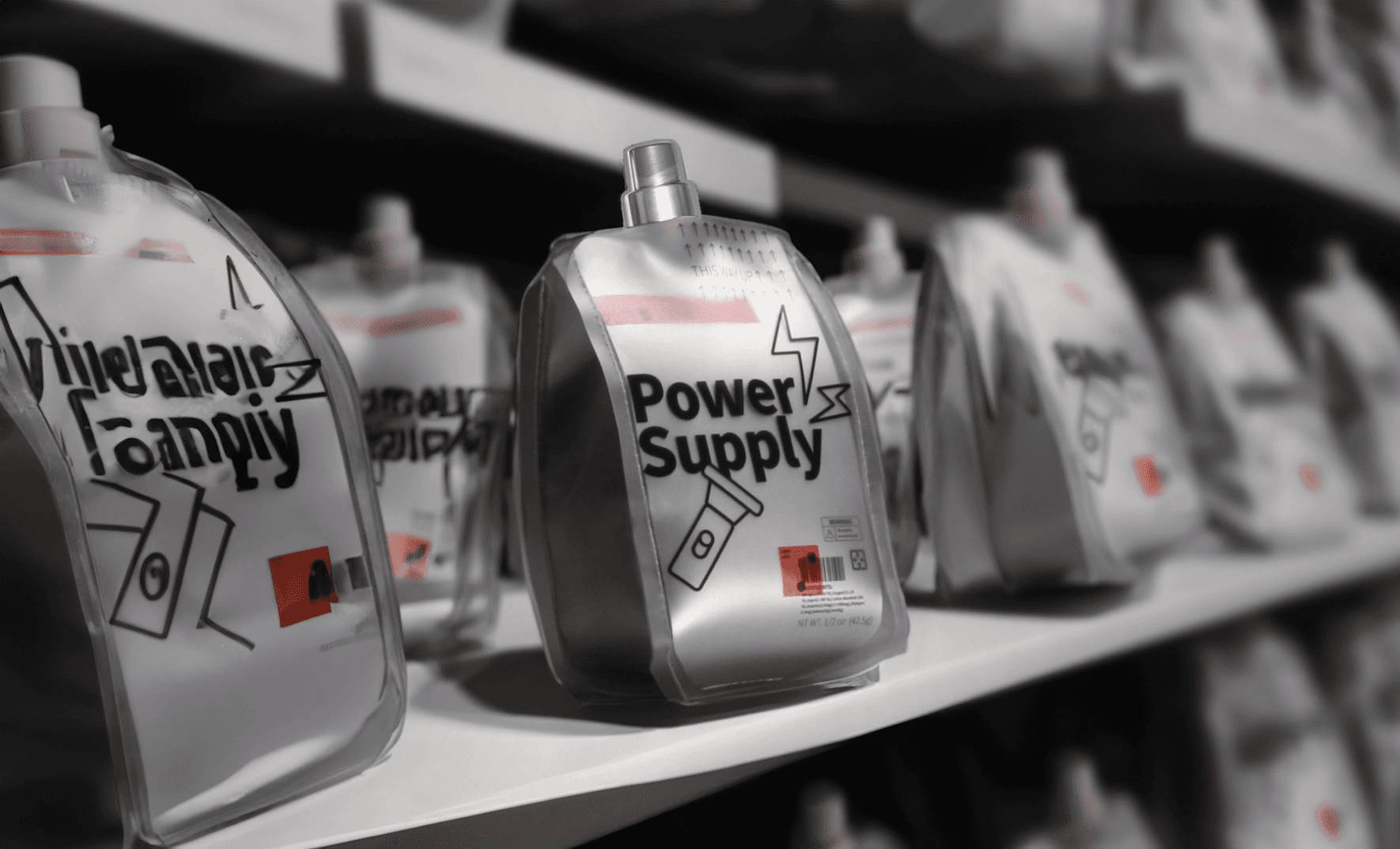
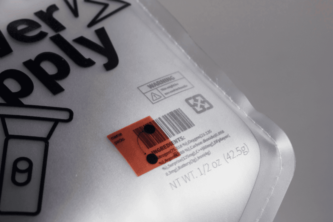
Power Supply
A conventional energy drink package reimagined through clever Mandarin wordplay, where "Energy" (能量) aligns with "Can Shine" (能亮). This design transforms the metaphorical concept of energy into a literal luminous experience. When users squeeze the package, a bending sensor embedded within foam detects the pressure and triggers an LED light that adjusts its brightness in response to touch intensity. The harder you squeeze, the brighter it glows, creating a direct physical connection between applied energy and visual output that makes the wordplay tangible.

Challenges & Constraints
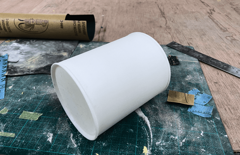
Creating convincing replicas of commercial packaging required careful attention to materials, printing quality, and structural integrity while concealing electronic components. Balancing the need for realistic appearance with the technical requirements of interactive systems demanded innovative approaches to component placement and activation mechanisms.
Ensuring the surprise element remained fresh across multiple interactions presented design challenges—each piece needed to deliver impact on first encounter while maintaining some appeal for repeated use. Additionally, creating robust electronics that could withstand the physical interaction required for activation demanded careful component selection and protection.


Reflection
Developing PackMeme taught me that surprise isn't just about the unexpected—it's about the careful orchestration of expectation and revelation. The most successful pieces in the series were those that balanced familiar visual language with genuinely unexpected experiences, creating a cognitive gap that users found delightful rather than jarring.
The project challenged my understanding of how digital culture translates to physical space. While memes work through rapid consumption and sharing, physical meme objects require sustained attention and hands-on engagement. This shift from passive consumption to active participation changes how humor functions, making it more personal and memorable.
Working with Arduino and basic electronics revealed how technology can become invisible when properly integrated into familiar forms. The most successful interactions were those where users forgot they were engaging with electronic devices, instead focusing on the experience itself. This taught me the importance of hiding complexity behind simplicity in interaction design.